
NPR’s Planet Money published two excellent graphs this week, comparing health care spending in the US now versus the 70s and 90s. For example, here’s what they reveal about hospital versus non-hospital spending:
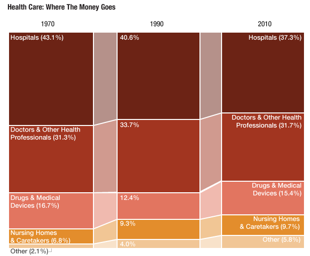
In other words, hospitals have a shrinking proportion of the health care dollar, but not one that is shrinking very much. Despite so much reduction in length of stay, and so much pressure to control hospital costs, their contribution to health care spending hasn’t declined that much. (In fact, given the huge rise in health care spending since the 70s, it is clear that hospital costs are growing. Take that, DRGs!)
Then there is the question of who is paying for this. Turns out: out-of-pocket expenses have shrunk, proportionally, since the 70s:
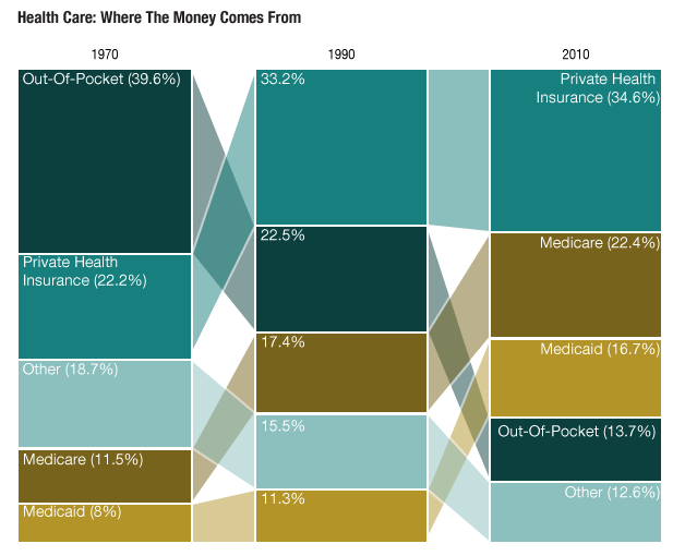
How could this be? Especially with what I posted just the other day?
For starters, this graph does not include a person’s contribution to insurance costs as part of their out-of-pocket expenses. So if, say, a person buys a Medicare Supplemental insurance plan with their own money, that wouldn’t be called an out-of-pocket expense here. That would come under private insurance. Co-pays on Medicare, though, or on private insurance would count as an out-of-pocket expense. Kind of confusing.
And also keep in mind: these proportions are hiding the bigger story. Health care costs, even after accounting for inflation, have risen dramatically since the 70s. A third of a small pie is nothing compared to a quarter of a gargantuan one! (Click here to view comments)